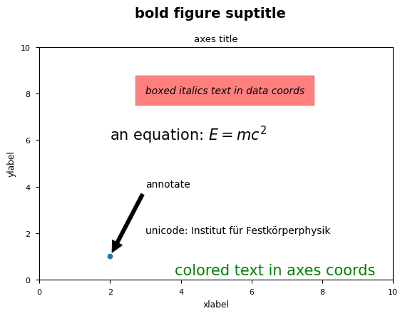
# Set titles for the figure and the subplot respectively fig.suptitle('bold figure suptitle', fontsize=14, fontweight='bold') ax.set_title('axes title')
ax.set_xlabel('xlabel') ax.set_ylabel('ylabel')
# Set both x- and y-axis limits to [0, 10] instead of default [0, 1] ax.axis([0, 10, 0, 10])
ax.text(3, 8, 'boxed italics text in data coords', style='italic', bbox={'facecolor': 'red', 'alpha': 0.5, 'pad': 10})
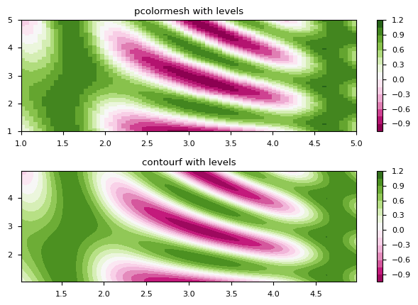
# make these smaller to increase the resolution dx, dy = 0.05, 0.05
# generate 2 2d grids for the x & y bounds y, x = np.mgrid[slice(1, 5 + dy, dy), slice(1, 5 + dx, dx)]
z = np.sin(x)**10 + np.cos(10 + y*x) * np.cos(x)
# x and y are bounds, so z should be the value *inside* those bounds. # Therefore, remove the last value from the z array. z = z[:-1, :-1] levels = matplotlib.ticker.MaxNLocator(nbins=15).tick_values(z.min(), z.max())
# pick the desired colormap, sensible levels, and define a normalization # instance which takes data values and translates those into levels. cmap = plt.get_cmap('PiYG') norm = matplotlib.colors.BoundaryNorm(levels, ncolors=cmap.N, clip=True)
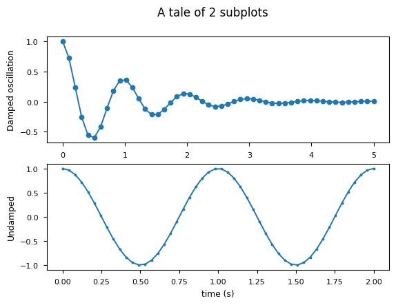
fig, (ax0, ax1) = plt.subplots(nrows=2)
im = ax0.pcolormesh(x, y, z, cmap=cmap, norm=norm) fig.colorbar(im, ax=ax0) ax0.set_title('pcolormesh with levels')
# contours are *point* based plots, so convert our bound into point centers cf = ax1.contourf(x[:-1, :-1] + dx/2., y[:-1, :-1] + dy/2., z, levels=levels, cmap=cmap) fig.colorbar(cf, ax=ax1) ax1.set_title('contourf with levels')
# adjust spacing between subplots so `ax1` title and `ax0` tick labels # don't overlap fig.tight_layout()
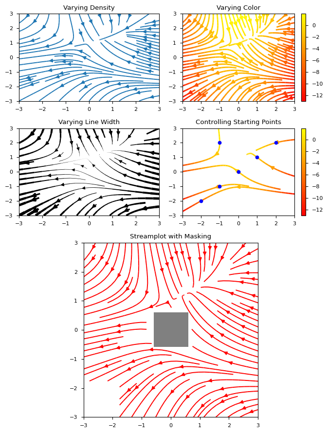
# Varying density along a streamline ax0 = fig.add_subplot(gs[0, 0]) ax0.streamplot(X, Y, U, V, density=[0.5, 1]) ax0.set_title('Varying Density')
# Varying color along a streamline ax1 = fig.add_subplot(gs[0, 1]) strm = ax1.streamplot(X, Y, U, V, color=U, linewidth=2, cmap='autumn') fig.colorbar(strm.lines) ax1.set_title('Varying Color')
# Varying line width along a streamline ax2 = fig.add_subplot(gs[1, 0]) lw = 5*speed / speed.max() ax2.streamplot(X, Y, U, V, density=0.6, color='k', linewidth=lw) ax2.set_title('Varying Line Width')
# Controlling the starting points of the streamlines seed_points = np.array([[-2, -1, 0, 1, 2, -1], [-2, -1, 0, 1, 2, 2]])
ax3 = fig.add_subplot(gs[1, 1]) strm = ax3.streamplot(X, Y, U, V, color=U, linewidth=2, cmap='autumn', start_points=seed_points.T) fig.colorbar(strm.lines) ax3.set_title('Controlling Starting Points')
# Displaying the starting points with blue symbols. ax3.plot(seed_points[0], seed_points[1], 'bo') ax3.set(xlim=(-w, w), ylim=(-w, w))
# Create a mask mask = np.zeros(U.shape, dtype=bool) mask[40:60, 40:60] = True U[:20, :20] = np.nan U = np.ma.array(U, mask=mask)
ax4 = fig.add_subplot(gs[2:, :]) ax4.streamplot(X, Y, U, V, color='r') ax4.set_title('Streamplot with Masking')
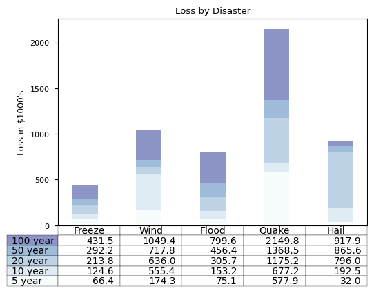
# Get some pastel shades for the colors colors = plt.cm.BuPu(np.linspace(0, 0.5, len(rows))) n_rows = len(data)
index = np.arange(len(columns)) + 0.3 bar_width = 0.4
# Initialize the vertical-offset for the stacked bar chart. y_offset = np.zeros(len(columns))
# Plot bars and create text labels for the table cell_text = [] for row inrange(n_rows): plt.bar(index, data[row], bar_width, bottom=y_offset, color=colors[row]) #plt.bar(index, data[row], bar_width, bottom=y_offset, color=colors[row], tick_label=columns) #绘制正常的条形图 #plt.barh(index, data[row], bar_width, left=y_offset, color=colors[row], tick_label=columns) #绘制水平条形图,下面代码中的x、y轴标签等信息也需要修改 y_offset = y_offset + data[row] cell_text.append(['%1.1f' % (x / 1000.0) for x in y_offset]) # Reverse colors and text labels to display the last value at the top. colors = colors[::-1] cell_text.reverse()
# Adjust layout to make room for the table: plt.subplots_adjust(left=0.2, bottom=0.2)
plt.ylabel("Loss in ${0}'s".format(value_increment)) plt.yticks(values * value_increment, ['%d' % val for val in values]) plt.xticks([]) #如果不加入表格的话,可以注释掉这一行 plt.title('Loss by Disaster')
plt.show()
png
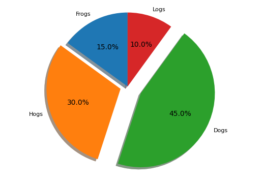
饼图
1 2 3 4 5 6 7 8 9
# Pie chart, where the slices will be ordered and plotted counter-clockwise: labels = 'Frogs', 'Hogs', 'Dogs', 'Logs' sizes = [15, 30, 45, 10] explode = (0, 0.1, 0.2, 0) #代表是否将某一个扇形区域分开
fig1, ax1 = plt.subplots() ax1.pie(sizes, explode=explode, labels=labels, autopct='%1.1f%%', shadow=True, startangle=90) ax1.axis('equal') # Equal aspect ratio ensures that pie is drawn as a circle.
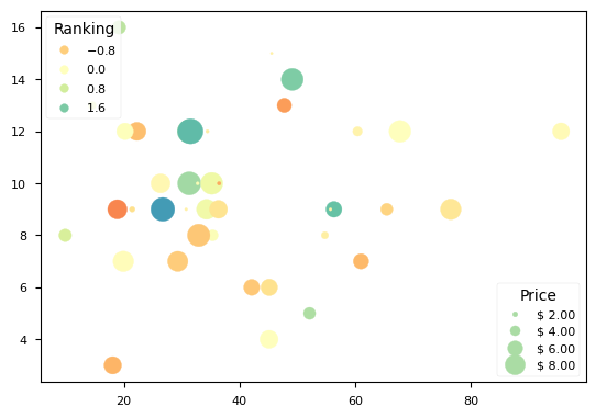
# Because the price is much too small when being provided as size for ``s``, # we normalize it to some useful point sizes, s=0.3*(price*3)**2 scatter = ax.scatter(volume, amount, c=ranking, s=0.3*(price*3)**2, vmin=-3, vmax=3, cmap="Spectral")
# Produce a legend for the ranking (colors). Even though there are 40 different # rankings, we only want to show 5 of them in the legend. legend1 = ax.legend(*scatter.legend_elements(num=5), loc="upper left", title="Ranking") ax.add_artist(legend1)
# Produce a legend for the price (sizes). Because we want to show the prices # in dollars, we use the *func* argument to supply the inverse of the function # used to calculate the sizes from above. The *fmt* ensures to show the price # in dollars. Note how we target at 5 elements here, but obtain only 4 in the # created legend due to the automatic round prices that are chosen for us. kw = dict(prop="sizes", num=5, color=scatter.cmap(0.7), fmt="$ {x:.2f}", func=lambda s: np.sqrt(s/.3)/3) legend2 = ax.legend(*scatter.legend_elements(**kw), loc="lower right", title="Price")
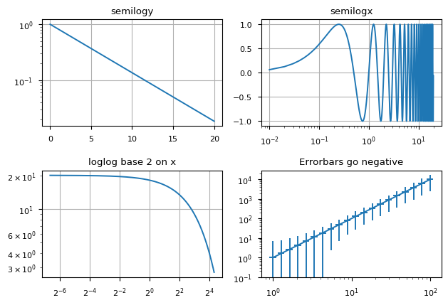
# log x and y axis ax3.loglog(t, 20 * np.exp(-t / 10.0)) ax3.set_xscale('log', base=2) ax3.set(title='loglog base 2 on x') ax3.grid()
# With errorbars: clip non-positive values # Use new data for plotting x = 10.0**np.linspace(0.0, 2.0, 20) y = x**2.0
ax4.set_xscale("log", nonpositive='clip') ax4.set_yscale("log", nonpositive='clip') ax4.set(title='Errorbars go negative') ax4.errorbar(x, y, xerr=0.1 * x, yerr=5.0 + 0.75 * y) # ylim must be set after errorbar to allow errorbar to autoscale limits ax4.set_ylim(bottom=0.1)
fig.tight_layout()
png
极坐标
1 2 3 4 5 6 7 8 9 10 11
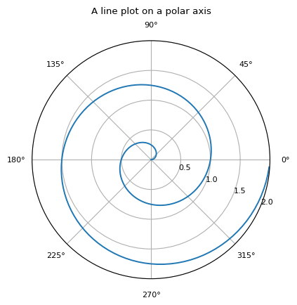
r = np.arange(0, 2, 0.01)
theta = 2 * np.pi * r

fig, ax = plt.subplots(subplot_kw={'projection': 'polar'})
ax.plot(theta, r)
ax.set_rmax(2)
ax.set_rticks([0.5, 1, 1.5, 2])  # Less radial ticks
ax.set_rlabel_position(-22.5)  # Move radial labels away from plotted line
ax.grid(True)

ax.set_title("A line plot on a polar axis", va='bottom')